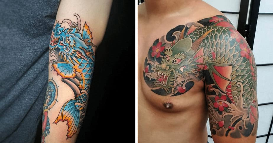
Hey — thinking about a dragon koi tattoo? I get it. There are so many directions you can go and it’s easy to feel overwhelmed. What I love most about this pairing is how loaded it is with meaning: the dragon brings power, strength, and determination, while the koi stands for perseverance and grit. If you’ve crawled your way through heartbreak or just want a reminder of how resilient you are, this combo is a beautiful, symbolic choice. So I pulled together a bunch of styles and color ideas to help you imagine what yours could look like.
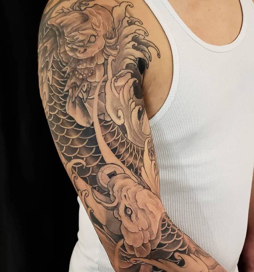
Moody black-and-gray dragon koi (but still dramatic)
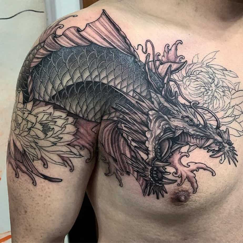
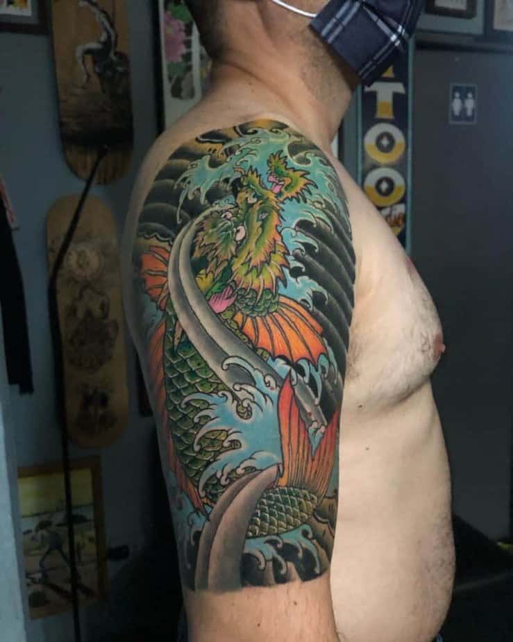
Credit: @matthewtran.tattoo
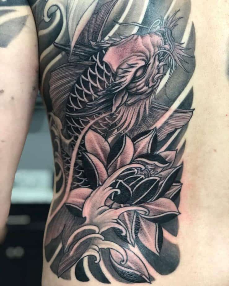
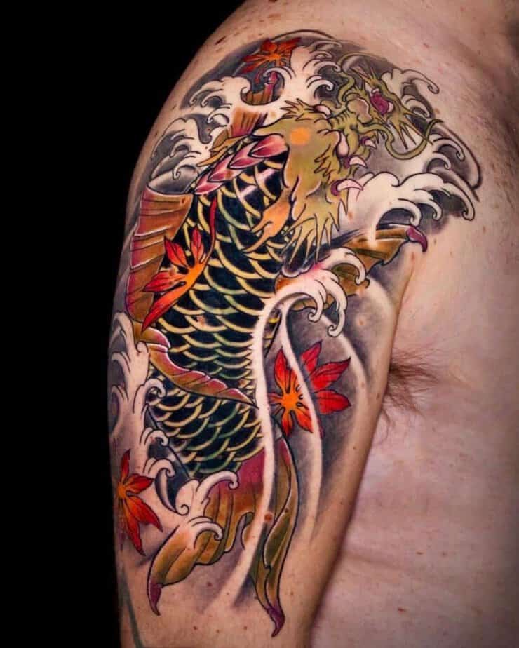
Credit: @derekchungtattoos
Credit: @rodrigomelotattoo
Credit: @brian__tattoos
Credit: @carsontattoos
Credit: @kassidyrikertattoo
So here’s the vibe with black-and-gray: you can totally capture the majestic, Japanese-inspired energy without color. Shadows and scale details do all the heavy lifting, and a bold black flower or a dark background can balance the whole piece. If you want a little pop, tiny touches of red or yellow can bring focus to the head or fins without breaking the monochrome feel. I also love how two koi can intertwine across a chest and still read clearly — there’s room for texture in the heads and movement in the waves, so sleeves often feel like the right call. And if you want contrast, heavy black scales against pale waves make the design sing.
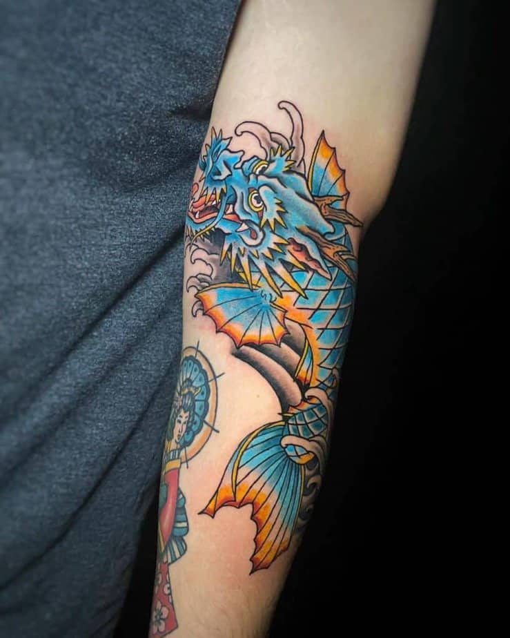
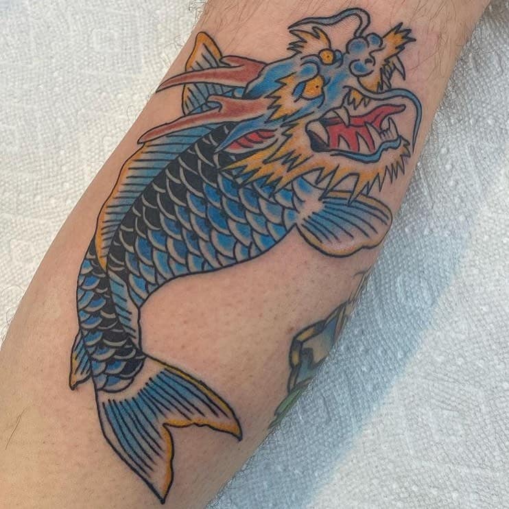
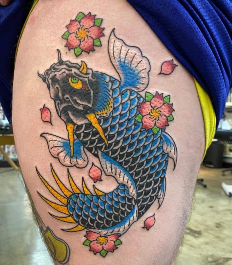
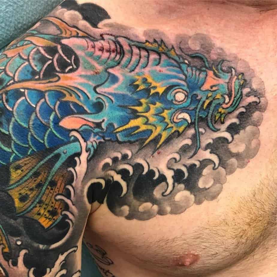
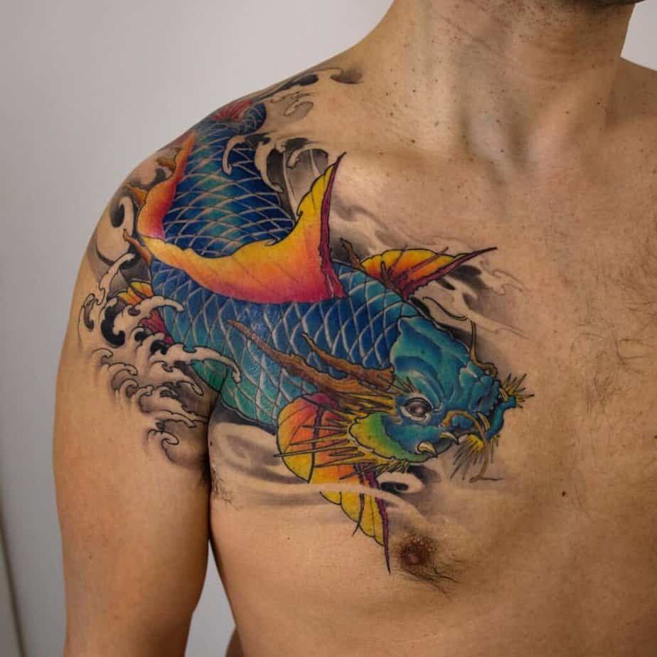
Blues that feel protective and strong
Credit: @elisebrunkel
Credit: @justin7861_sic
Credit: @thugloopy
Credit: @dominicholmes_art
Credit: @mastershark_hontattoo
Fun fact: different koi colors mean different things, and blue usually nods to masculinity and fertility — so if that resonates, this palette is worth considering. Blue ink can be very saturated, and little yellow highlights or horns help the dragon side read clearly. You can go full Japanese with cherry blossoms and clouds, or use negative space so the blues feel dimensional and the waves look like real movement. Some pieces even blend blue into turquoise with an ombré effect so the scales shift as they travel down the body.
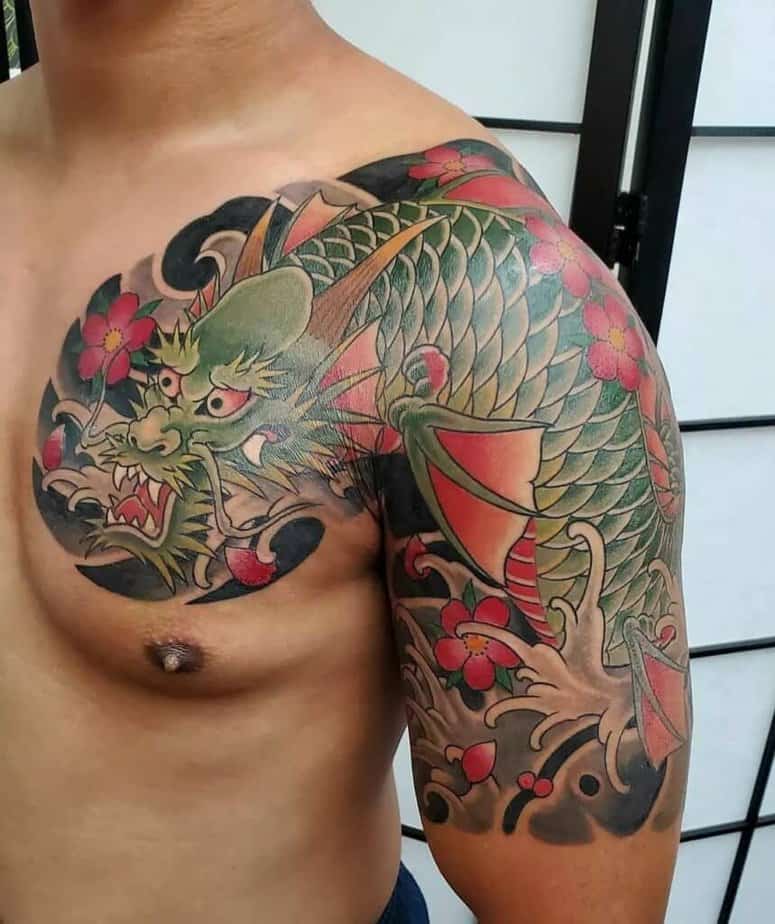
Green koi that whisper luck and growth
Credit: @axis_ink
Credit: @alexramosart
Green koi often mean prosperity and luck — it’s earthy and feels connected to nature, which makes it a great pick if you’re into outdoorsy symbolism. These designs often play with contrast: greens against pinks, or a colorful fish set off by a darker black-and-gray background. I’m always into fins that fade from yellow into orange with a red tip — it keeps the color palette rich and unexpected.
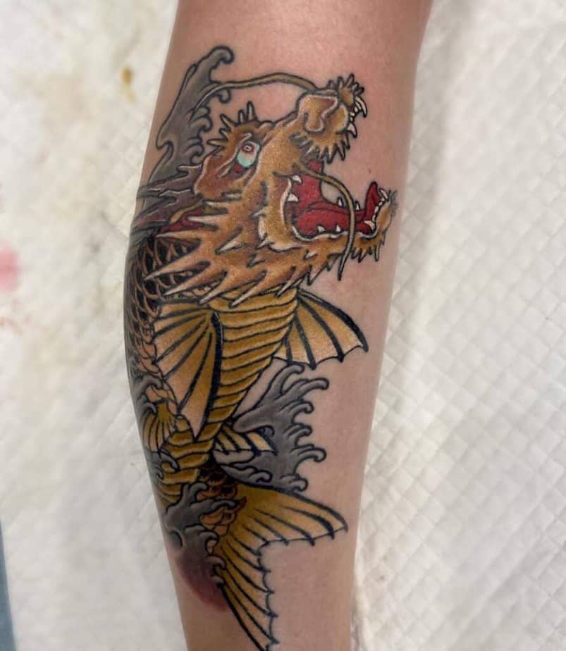
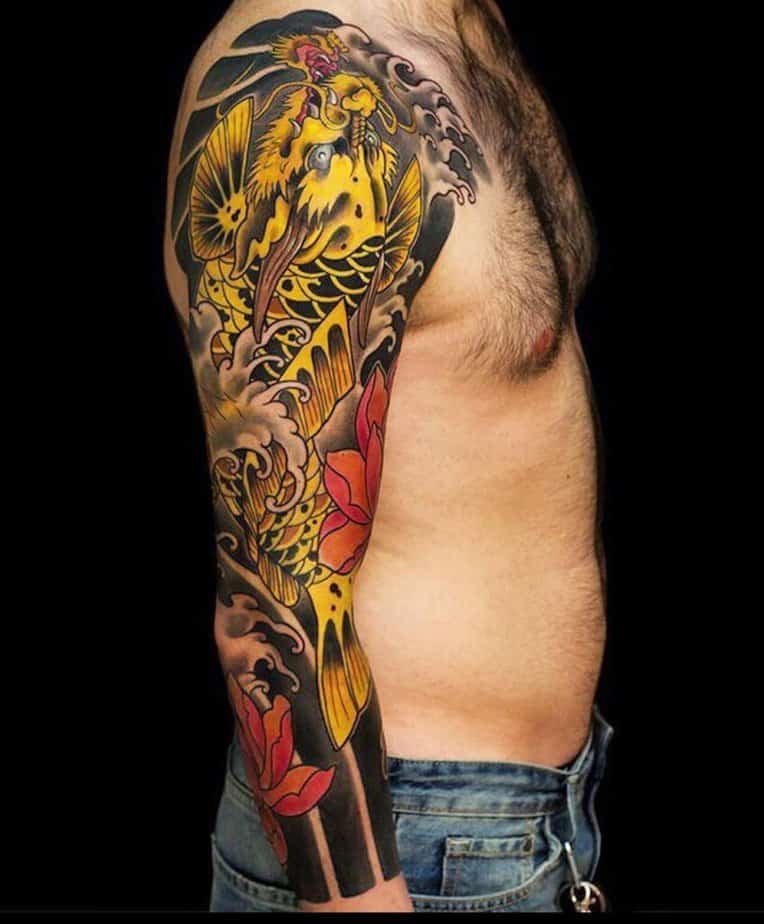
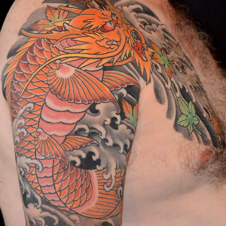
Warm golds and yellows for abundance
Credit: @isa_startattoo

Credit: @tattooist_ann
Credit: @mothytim
Credit: @bayarea_tattoo
Credit: @aaron_bell
Yellow and gold speak of wealth and abundance, kind of autumnal and grounding. Leaves, oranges, and reds make beautiful contrast here. You can keep it simple with mostly black-and-yellow tones and a few red accents, or go full saturation with red-orange flowers and a deep black background for drama. Composition matters a lot with these pieces — when the color saturation and layering are right, the whole thing looks majestic.
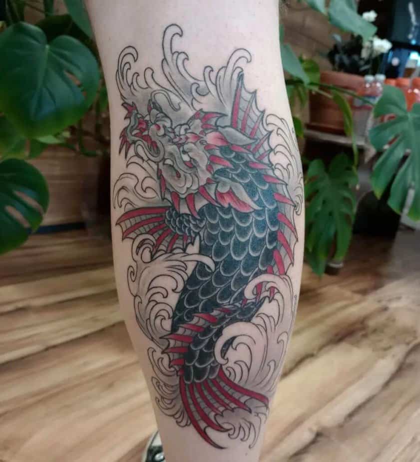
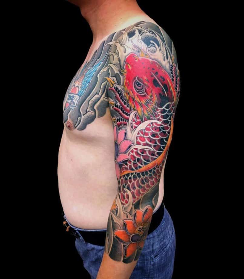
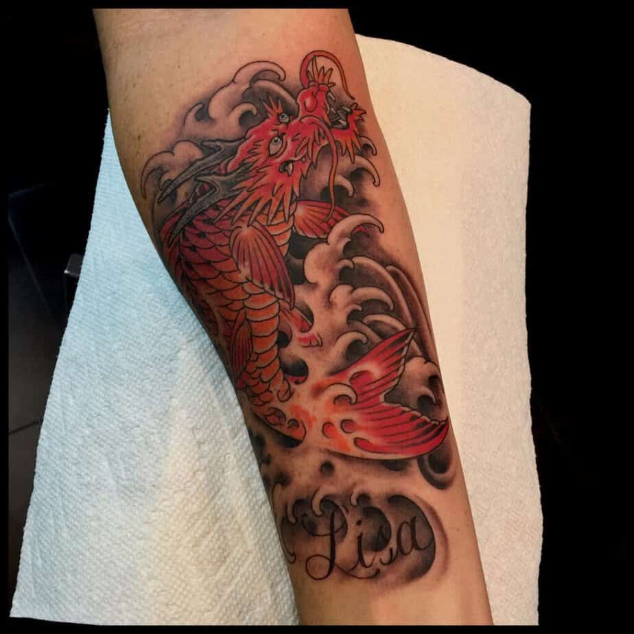
Red koi: passion, fire, and intensity
Credit: @horigo
Credit: @justinweatherholtz

Credit: @jensschnettler

Red koi can mean love and passion or anger and aggression — you pick your own story. These tattoos can get pretty vivid, with reds blending into yellows and greens on the face and fins, and occasionally claws showing to remind you of the dragon energy. Traditional Japanese compositions work great with red koi: bold waves in black-and-gray make the red read even stronger, and pops of turquoise or blue around the eyes or leaves can add a fresh twist.
Wrap-Up
Anyway, whether you want something moody and grayscale or a bright, symbolic piece that screams resilience, there’s a dragon koi for you. I love how personal these can be — they look fierce, but they’re also deeply meaningful. If you’re planning one, think about the emotion you want it to carry (strength, luck, love) and let that guide your color choice and placement. Let me know which one you’re leaning toward — I want to hear about it and I’ll help you brainstorm placement or tiny details if you want.